
Lifestyle
The Instagram Logo And Brand: The History And Evolution
Dec
Colorful, relatable, and nostalgic, the Instagram logo has a fascinating history, which is responsible for its current avatar. Let’s explore the the history and evolution Instagram Logo with TeeHolic.us:
In 2010, the company picked up on the surge of photographs shot on mobile phones, which were finding prominence around the internet. They decided to create a permanent residence for every mobile phone user’s best pictures and add a dash of filters and cool effects.
Over time, Instagram has become an admired brand, which would be impossible without accrediting its logo. Let’s explore the story behind this iconic logo design that has become a benchmark for all modern businesses.
A short history behind Instagram
Instagram was launched in October 2010 in the US and became one of the most consumed brands in the world in just twelve years. The name is a portmanteau of “instant” and “telegram,” inspired by the speed at which the Polaroid camera would make images available.
The evolution of the Instagram logo through the years
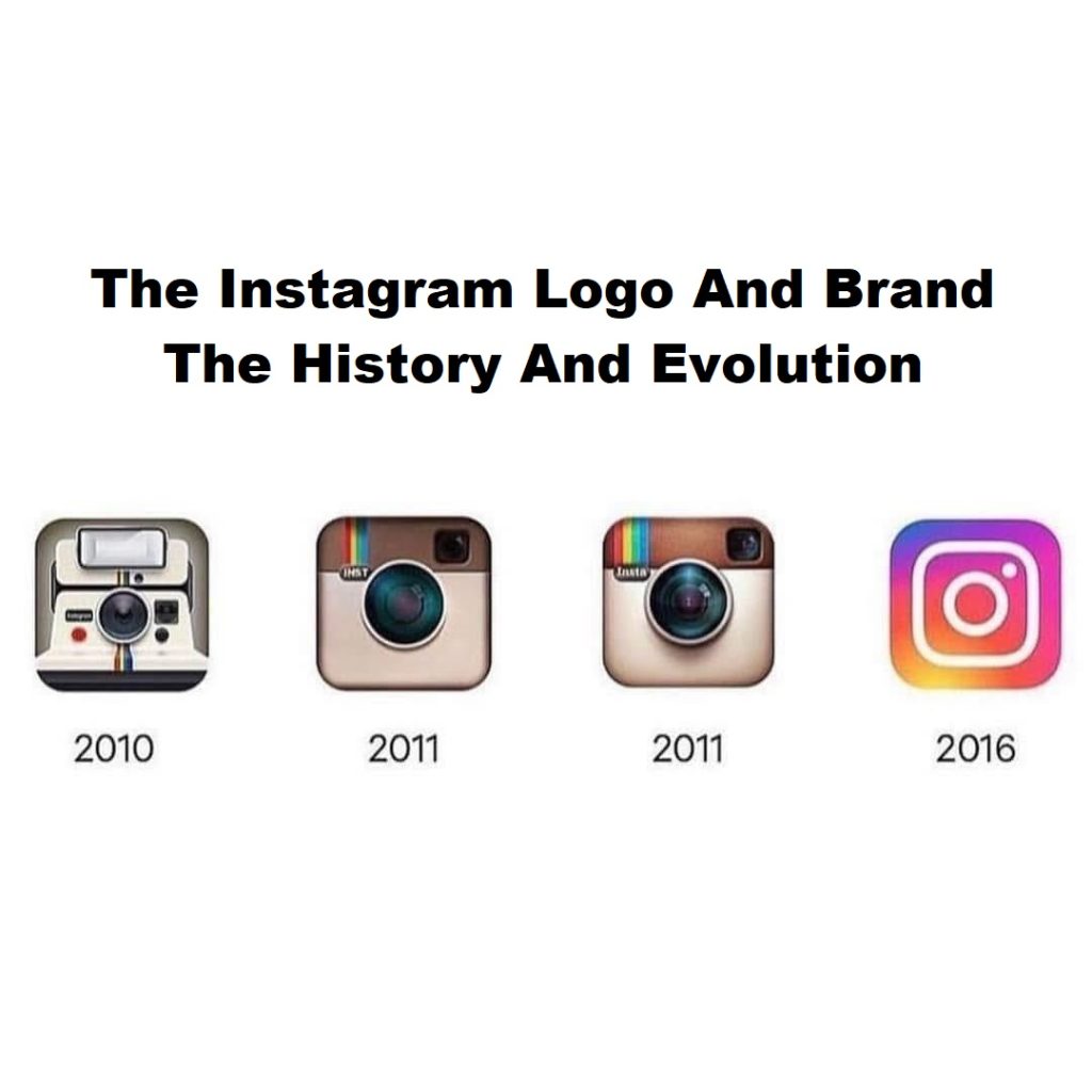
The original Instagram logo was designed in 2010 by one of its founders, Kevin Systrom. The logo drew its inspiration from Polaroid cameras, which could capture and print images within moments. This mnemonic is the only consistent aspect of the logo’s redesigns through a decade of audiences who have grown with the app.
2010: The Polaroid camera

In the first Instagram logo, Systrom simply displayed the frontal shot of a Polaroid camera. It is more of a picture than a logo, to be honest. It had the word “Instagram” inscribed in a tiny font.
One striking characteristic of the 2010 design to be carried on in different logo variations (along with the Polaroid camera) is the rainbow band that runs vertically across the visual. Another element that seems to have stuck is the rounded square shape of the logo. The logo may appear busy and cluttered today, but in 2010, it stood out among other social media icons.
2010 to 2011: The vintage viewfinder

Within just one year, Instagram’s unique filters won users’ hearts. The Instagram logo swiftly found its use across different phones and needed to be professionally designed. Systrom assigned the creation of a new logo to designer and photographer Cole Rise. He captured the essence of the shutter in minimal form.
Rise’s logo drew its inspiration from a 1950s Bell & Howell camera. The beige and brown logo looked more palatable in all sizes. The rainbow strip made it to the top-left corner of the logo, with “INST” inscribed across it in sans-serif. On the top-right corner is the viewfinder, which some may interpret as the front camera since selfies began taking over the internet.
2011 to 2016: A realistic touch

The difference between the second and the third logo is the detailing. The updates looked subtle. An untrained eye would even miss the update if they didn’t look closely. The top portion of the camera got a leathery textured feel, the lens was made more realistic with depth and glare, and the gradients on the logo got more contrast.
The rainbow strip displayed the four primary colors — red, yellow, green, and blue — in distinctly broader strokes. The inscription was now in title case and retained the “Insta” abbreviation but in bold serif.
2016 to 2022: Gradient beauty

2016 saw the arrival of the most revolutionary Instagram logo. The designers integrated the three elements from the first logo: the polaroid shutter, the rounded square shape, and the rainbow brand colors. The vibrant colors turned into a gradient and filled the logo up. A bold white dot continued to represent the front camera at the top-right corner.
The internet argued over the logo because of its radical minimalism and abstractness. The logo sported a flatter form and a blue-to-orange-to-pink gradient. The logo completely dropped any typography and instead represented the camera’s form with bold white lines.
2022 to today: A vivid redesign

The most recent update to the logo saw the lightening of the colors, with no change in the bold lines to represent the camera. The blue color was toned down, while brighter colors like pink and yellow became more noticeable.
Cynthia Pratomo, Creative Director of Instagram, had this to say about the design:
“We approached the design evolution from a spirit of innovation and exploration by assembling a brain trust of global typographers, artists, and creative technologists who’d push our boundaries. Together, we kept the best of the brand while infusing it with new energy and powers of expression.”
Get a look at the Apparel Collection by Teeholic
We have many attractive, hot trend items, suitable for many audiences. Buy now, take a cool picture, and post it on instagram. This is also a meaningful gift you can give to relatives, birthday gift for mom & dad, christmas gift for boyfriend & girlfriend.


